Instagram Logo Refreshed
Instagram Unveils First New Logo Wordmark in Eight Years, Adopting Modern Half-Cursive Design
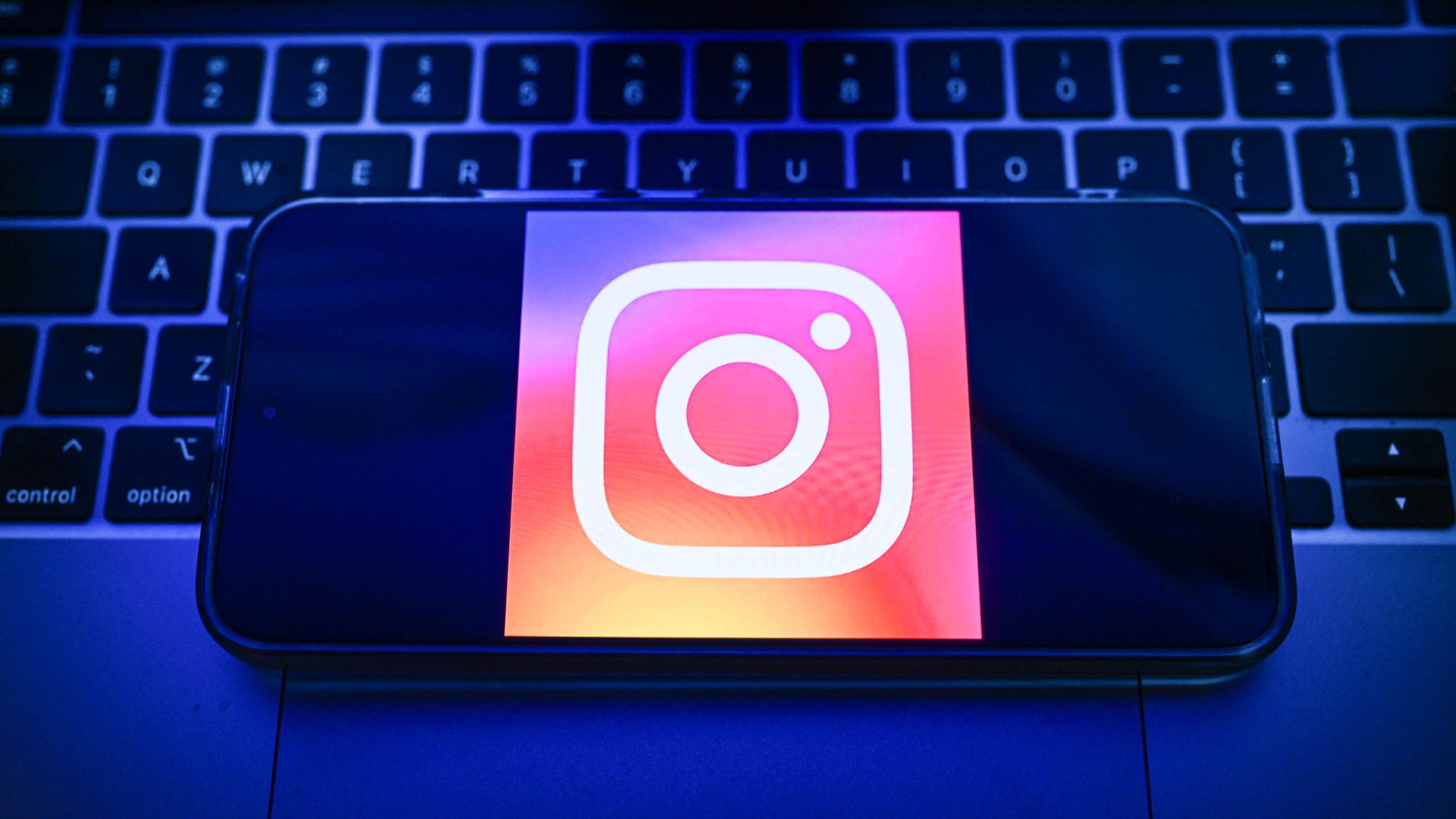
Instagram has unveiled a new logo wordmark for the first time in nearly a decade. The platform replaced its classic all-cursive script with a fresh design that blends half-cursive and half-print letters, according to NBC Bay Area.
Instagram head Adam Mosseri announced the change on his own Instagram and Threads accounts. The app icon — the familiar rainbow camera — stays the same. Only the text logo is changing, making it the first wordmark update since 2016.
From Full Cursive to a Mixed Script Style
The old Instagram wordmark used a fully cursive font that had been in place since 2016 — nearly nine years. The new design mixes cursive and print letters together. It gives the name a more modern, slightly casual look while still feeling handwritten, NBC Philadelphia reported.
The shift is subtle but significant for a platform with over two billion users. Wordmarks — the text portion of a logo — are a key part of brand identity. Changing one after nearly a decade signals a deliberate push to refresh how Instagram presents itself.
Mosseri Breaks the News on Instagram and Threads
Adam Mosseri shared the announcement directly on Instagram and Threads, Meta's text-based rival to X. By posting on both platforms, Mosseri put himself front and center for the reveal. No separate press release or ad campaign was used — just a post from the platform's own head, according to NBC Boston.
Threads, where Mosseri also posted, is owned by Meta — the same parent company as Instagram. Using Threads for the announcement also served as a quiet promotion for that platform, which competes directly with X for real-time social conversation.
App Icon Unchanged — Logo Swap Stays Limited
Instagram is not touching its iconic app icon. The colorful gradient camera square that users tap on their phones will look exactly the same. Only the word "Instagram" as it appears in text form is getting the new look, NBC Chicago confirmed.
That makes this a focused, low-risk update. Changing a full icon can trigger major backlash — users are creatures of habit. By keeping the camera icon intact, Instagram avoids the kind of outrage that hit other apps when they overhauled recognizable symbols. The wordmark update is a smaller bet.
First Brand Refresh in Nine Years Marks a New Era
The last time Instagram changed its wordmark was in 2016 — the same year it also swapped its older brown camera icon for the current rainbow gradient design. That 2016 overhaul was one of the most talked-about rebrands in social media history, drawing both praise and sharp criticism, according to NBC Philadelphia.
Nine years is a long stretch in the fast-moving world of social media. Rivals like TikTok and Snapchat have evolved their visual identities regularly. This update suggests Instagram wants its branding to feel as current as its features — even if the change is quiet enough that many users may not notice right away.
Sentiment
NeutralPublishers
12
Articles
20
Reach
32